Managed & Developed Websites

Extrinite Website

web-atti

View Website

About

Extrinite is a metal service expert in the Houston area. I was contracted to create a website that will generate more leads.

Rodeo Website

web-rodeo

View Website

Responsibilities

Each year the Houston Livestock Show and Rodeo goes through a brand refresh. My role was to align the website’s look to the new 2023 brand standards.

North Loop Clinic Website

web-atti

View Website

About

North Loop is an urgent care clinic in Houston, Texas. Their expert physicians, nurse practitioners, and support staff provide quality same-day care for patients with non-life-threatening illnesses and injuries.

Responsibilities

I was contracted to build a website where patients can schedule an appointment and contact the clinic directly.

Aldine United Website

web-atti

View Website

About

Aldine United Soccer Club is a non profit organization providing members opportunities to play and develop at all ages and levels. My goal as the developer, was to create an appealing website where parents can register their kids for the season.

Junell Law Website

web-junell

View Website

Responsibilities

During my time at Forthea Interactive Marketing, I designed two site mockups for revisions and developed the entire site using WordPress. The client Junell Law was a new law firm in Houston, Texas in need of a web presence. The website contained information about the firm, their services, credentials, and contact information.

ATTI Website

web-atti

View Website

About

Advanced Tracking Technologies Inc. (ATTI) is a company based in Houston, Texas that specialize in GPS fleet vehicle tracking devices.

Problem

Sales were neutral and more competition was in the horizon. Most sales were coming from cold calling or references. There was more opportunity on the web for lead generation.

Solution

Redesigning the website and marketing more efficiently though the internet.

Responsibilities

As the Web Developer I focused on giving the website a modern look and making it responsive. I also created a brand standards packet that stated the proper email signature, business card, letter head, fonts, colors, and correct logo usage. Other of my responsibilities consisted of proposal designs, HTML emails, and web maintenance.

Results

Web leads increase by 400% due to effective ad marketing and design. More sales employees were hired, a new product was introduced to the tracking family, and budget was raised for the marketing department.

Illustrations

gd-silhouette gd-icons

Apple Pride 2016

Silhouettes
Four skyline silhouettes were created for the hosting cities of Apple’s Pride 2016 celebration (Singapore, Cork, San Francisco, and Austin). The images served as a background graphic for outgoing marketing materials.
Icons
Four icons were created for the hosting cities of Apple’s Pride 2016 celebration (Singapore, Cork, San Francisco, and Austin). The images served as graphics for in-house interfaces and applications.
unknown_design

Unown TrueType Font

As a designer, I decided to create a font family taken from the cartoon character Unown. The hardest part was done, since each character is a letter of the alphabet. All I had to do was trace the characters and turn them into vector files.
gd-ill-ninjas

Ninja Characters

Five ninja characters were created in order to enter a short story illustration competition. The idea was taken form super hero movies and shows. Each character honed their own unique powers and fought crime as a team.

Junell Law Website

web-junell

View Website

Responsibilities

During my time at Forthea Interactive Marketing, I designed two site mockups for revisions and developed the entire site using WordPress. The client Junell Law was a new law firm in Houston, Texas in need of a web presence. The website contained information about the firm, their services, credentials, and contact information.

Marketing Documents

gd-docs-atti

View Brand Standards

ATTI Brand Standards

The Advanced Tracking Technologies Inc. brand standards document was designed to organize the company marketing standards. The document was given to each employee and it served as a guide for them to reference anything brand related. It contained the proper use of the company logo, font families, business card layout, power point presentation, email signature, and more resourceful information about the company brand. Employees had to follow brand standards for any outgoing or client facing material. I designed the document to be visually appealing and easy to read. I wanted employees to fully understand the reason behind the company standards, and the importance of having cohesive brand.

gd-docs-ad

View Brief

Access Data Healthcare Brief

Access Data is a cyber security software company from Lindon, Utah. Their different security services and products help many stand-alone and enterprise level industries against fraudulent activities. I was tasked to design their healthcare industry brief. The brief was going to be given to different healthcare companies in hopes to educate customers and potentially earn their business. With this in mind, I focused on delivering high impact infographics and useful content that illustrates the need for security software.

ATTI Web Redesign

web-atti

View Website

About

Advanced Tracking Technologies Inc. (ATTI) is a company based in Houston, Texas that specialize in GPS fleet vehicle tracking devices.

Problem

Sales were neutral and more competition was in the horizon. Most sales were coming from cold calling or references. There was more opportunity on the web for lead generation.

Solution

Redesigning the website and marketing more efficiently though the internet.

Responsibilities

As the Web Developer I focused on giving the website a modern look and making it responsive. I also created a brand standards packet that stated the proper email signature, business card, letter head, fonts, colors, and correct logo usage. Other of my responsibilities consisted of proposal designs, HTML emails, and web maintenance.

Results

Web leads increase by 400% due to effective ad marketing and design. More sales employees were hired, a new product was introduced to the tracking family, and budget was raised for the marketing department.

Apple Check-in Dashboard

ux-ecd

View Desktop UI View Mobile UI


About

The Retail Internal Events (RIE) team in Cupertino, California focuses on hosting and supporting many Apple internal events. The team manages and markets the number of guest that are invited to each event. During the events, team members have admin access to realtime attendee information and analytics through a web tool called “Event Check-in”.

Problem

The web tool dashboard contained an overload of information. During these events everyone is working at a fast pace and require information quickly. Admin users struggled to find the information they needed.

Solution

Admin users wanted a visually organized and appealing dashboard. It will give the user a clear visual representation of all the analytics during events.

Responsibilities

As the UX/UI Designer, I was tasked to dive-in and create a variation of visually appealing dashboard layouts. I focused on breaking down the information by chucks and color in order to simplify the analytical clutter.

Results

The interface followed Apple standards and alleviated the information overload issue. Admin users were able to easily navigate the dashboard and find the information they needed.

Brands

edge-logo

Edge Preparatory School

The Client
A new preparatory school in Huntsville, Alabama was in need of a new brand for their institution. The institution’s core values focus on delivering high level education to their students, and becoming the next prestigious school in the area.
The Vision
Having the honor to brand an institution is meaningful, but at the same time intimidating. After speaking with the client, I learned two important factors – their passion behind education and the aerospace history in Huntsville. With this information in mind, I wanted the brand to revolve around tradition and vision of the institution.
The Result
The logo image illustrates an open book, welcoming and spreading education. The right side of the book contains the letter “E” (for Edge), and towards the top of the book sits a star resembling student success and aerospace. The text or wordmark of the logo follows a traditional serif font used by many prestigious institutions around the world. Both, the logo image and wordmark, can either sit alone or come together as one logo signature.
pmby-logo

Power Made By You

The Client
Power Made by You (PMBY) specializes in the sale and servicing of low to medium voltage circuit breakers and other electrical power distribution equipment. With many years of experience, PMBY has provided circuit breaker services to several companies across the U.S., and continues to support the needs of its customers. The company wanted a new modern image that matched their excellent services and customer satisfaction.
The Vision
After meeting with the CEO of the company, I gained a better understanding of his vision. In the near future, the company was looking to expand their services in to the solar energy industry. With this in mind, I wanted my design to resemble the company on the long run. I focused on a modern and discrete look that is not too distracting or overwhelming.
The Result
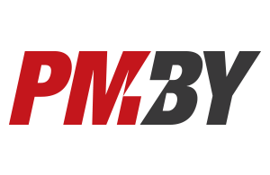
The logo gives the audience a hint of the company’s services, thanks to the thunderbolt located in the middle of “MB”. I intentionally wanted to use negative space to draw an image. This was all possible thanks to the italicization of the letters used. Lastly, no other competitors around the area used red and dark gray, which I used to separate the logo signature. Red is used for the “PM” and dark gray for “BY” in order to give the logo more character and color balance.
arm-logo

ARM Construction Corp.

The Client
ARM Construction Corp. is a construction company in Houston, Texas that bids on commercial size contracts. They have a long portfolio of successful projects and many years of experience. Most of their projects consisted of midsize contracts and they wanted a new image that would help them compete against bigger corporations.
The Vision
Given my past experience in labor work and the needs my customer expressed, I focused my designs around geometry, structure, and safety.
The Result
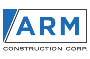
Right triangles are widely used in construction. They are created by the architects who design the blueprints and eventually make a structure come to life. A blue right triangle is located at the top left of the logo and was placed specifically in that location because the incline of the shape flows with the letter “A”. Lastly, the letters “ARM” are inside the gray box and “Construction Corp.” is on the outside of the box. This was done to illustrate ARM employees being safe from construction incidents.

Apple Master Blaster

ux-apple

View Prototype


About

The Retail Internal Events (RIE) team in Cupertino, California focuses on hosting and supporting many Apple internal events. The team manages and markets the number of guest that are invited to each event. Designed HTML emails are sent to each guest as an invitation to RSVP, provide more info with links, ticket with QR Code, or a simple confirmation of the event.

Problem

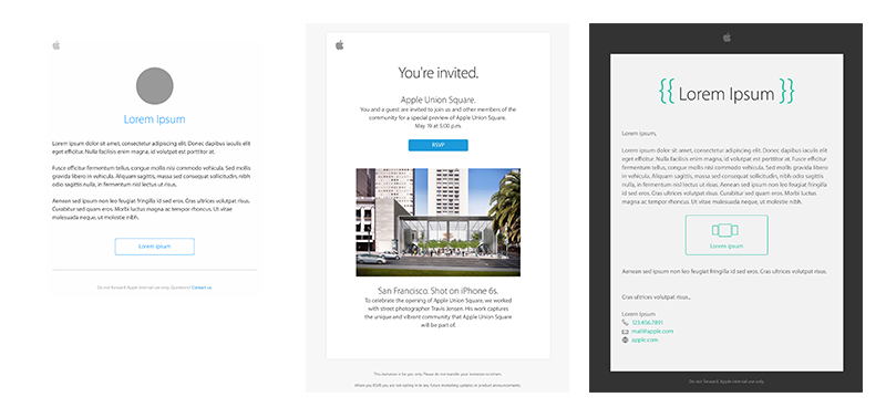
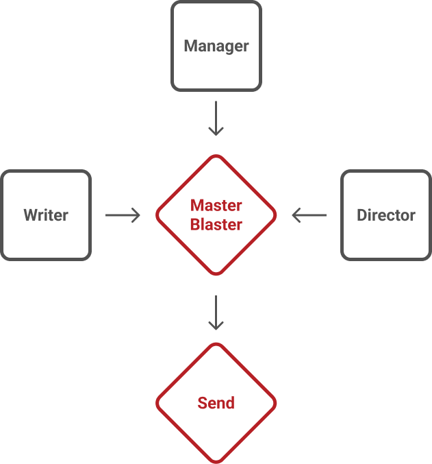
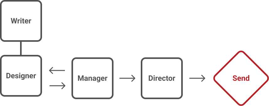
When it comes to HTML emails, there are many back and forth revisions between different team members. With only one designer managing and distributing the emails, It was hard to keep track of the email revisions. Sometimes the revision process was time consuming since the technical writer, account manager, and department director have to approve. In addition, the HTML file was passed around frequently and it was hard to keep track of the original file.

Solution

Third party email distribution web services could not be used due to exposing and compromising employee confidential information. The solution is to develop an in-house templatized communications builder, campaign manager, and email distribution conduit. This will allow everybody involved in the email revision process to view draft emails on the browser and make edits as they please. Account managers can also create their own emails by choosing from a library of templates and staying within the Apple standards. The designer is free from the revision process and can focus on the deployment of the email.

Responsibilities


As the UX/UI Designer, I was tasked to research different features and design the interface for project codename “Master Blaster”. I created discovery document that showcased all the features Master Blaster will consist of and how they benefit the team. After the research and discovery, I focused on the design strategy in making the user interface easy to navigate and the email builder easy to use.

Results

roadmap 
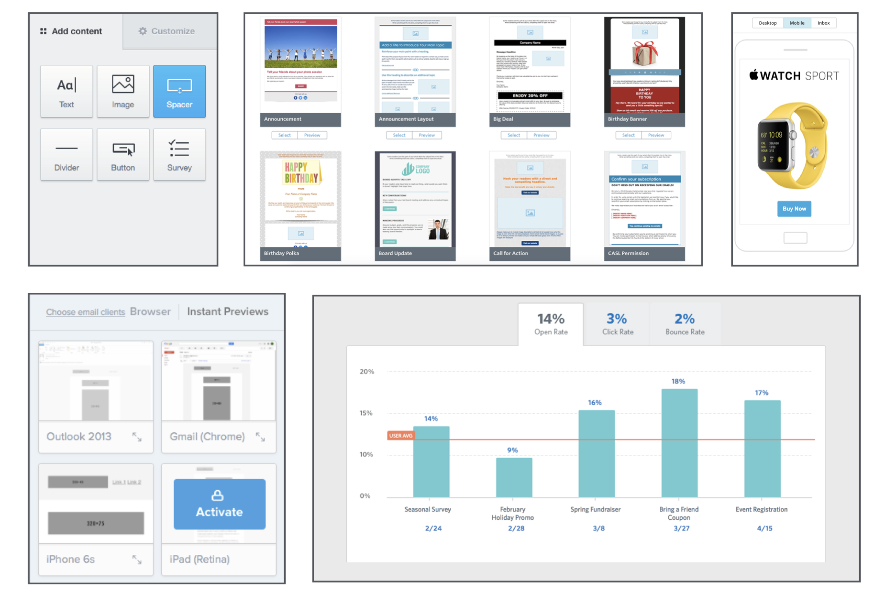
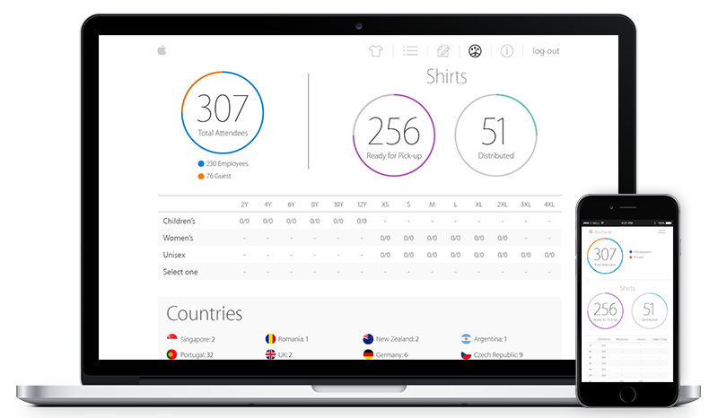
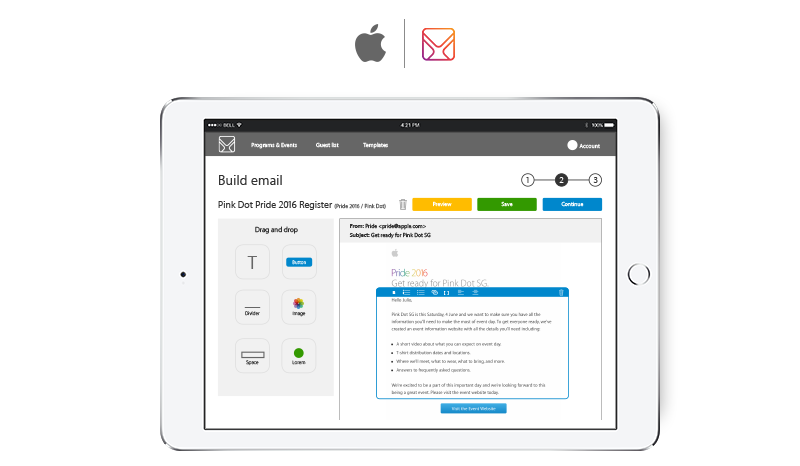
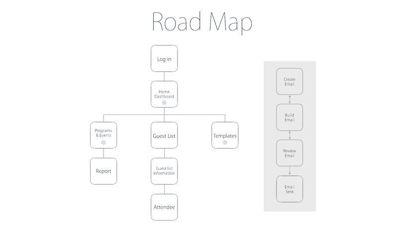
The interface followed Apple standards and consisted of 12 pages (Log in, Dashboard, Email Builder, etc.). A keynote presentation was given the team showcasing the user interface and all of the Master Blaster features

View Screen-flow

Web Marketing Assets

ux-apple

Apple Email Templates

The above html emails are samples of the verity of campaigns my team and I created. We focused on internal marketing which included invitations, newsletters, and thank you emails.
ux-apple

View Landing Page

ATTI Landing Page

The sample landing page above was one of the most successful in lead conversations. Judging by our analytics, it increased leads by 400% each week.
ux-apple

View Newsletter

BGSU Newsletter

During my time at Bowling Green State University, I created many HTML emails that were distributed to students and staff. Each email provided a graphic banner and specific information with links.