The Houston Livestock Show and Rodeo promotes agriculture by hosting an annual, family-friendly experience that educates and entertains the public, supports Texas youth, showcases Western heritage and provides year-round educational support within the community. Internal employees work on data heavy spreadsheets that are uploaded to the website for public view, such as daily events, lineup, and shopping and dining vendors.
Problem
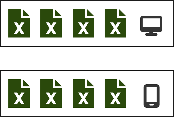
Data entry was a problem. By having multiple spreadsheets that do the same function was counter productive. In addition, the same data was placed in two different locations due to platform constraints.
Solution
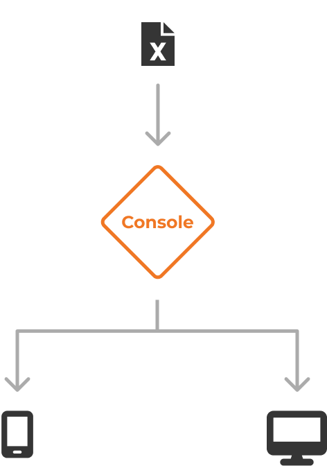
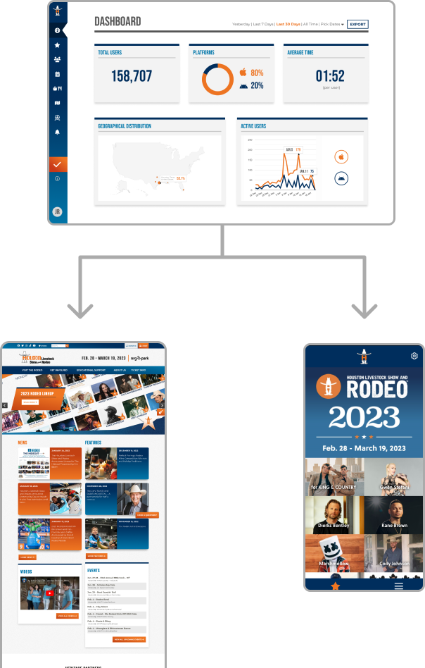
The solution was to centralize the data into one place. The console application will host all the data and push dedicated information to either the website or the mobile app. This will leveraging the data and uniform how the data is managed.
Responsibilities
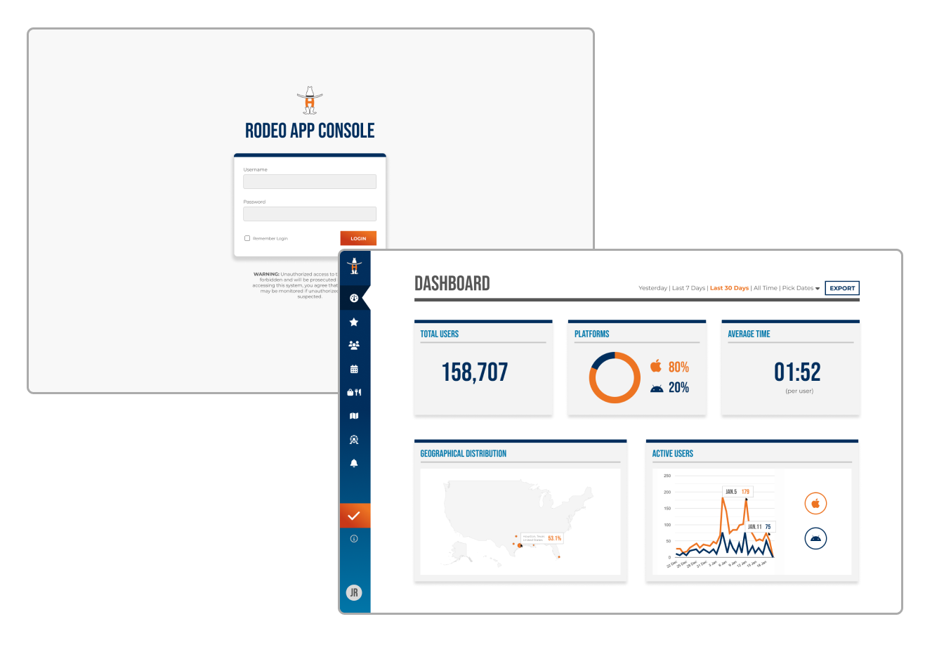
My focus was to architect the user experience for the new console platform. During the discovery phase, I created different layouts and conducted internal user interviews for research. The end goal was to design an interface that will be easy for internal employees to manage data entry and display useful analytics from the mobile app.
Results
The console solves a few problems: It centralizes data into one platform. It also makes the data easy to manage by multiple users. Lastly, it streamlines the data entry workflow.
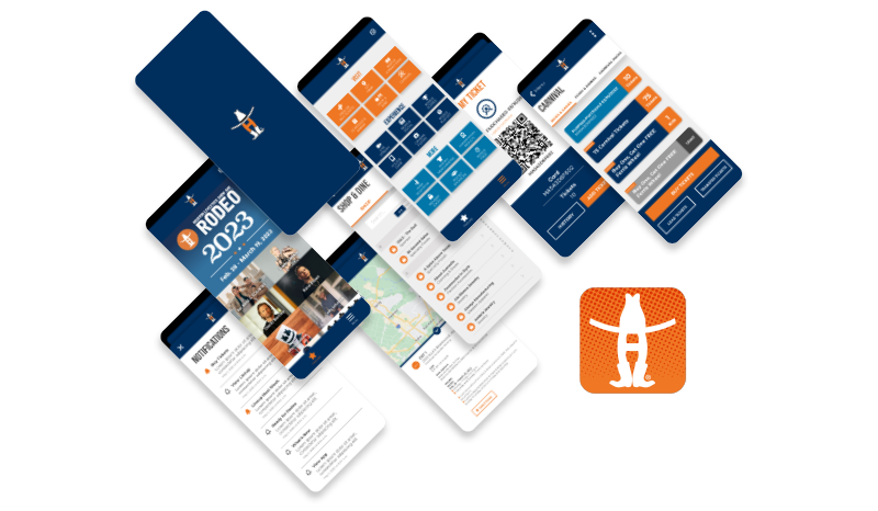
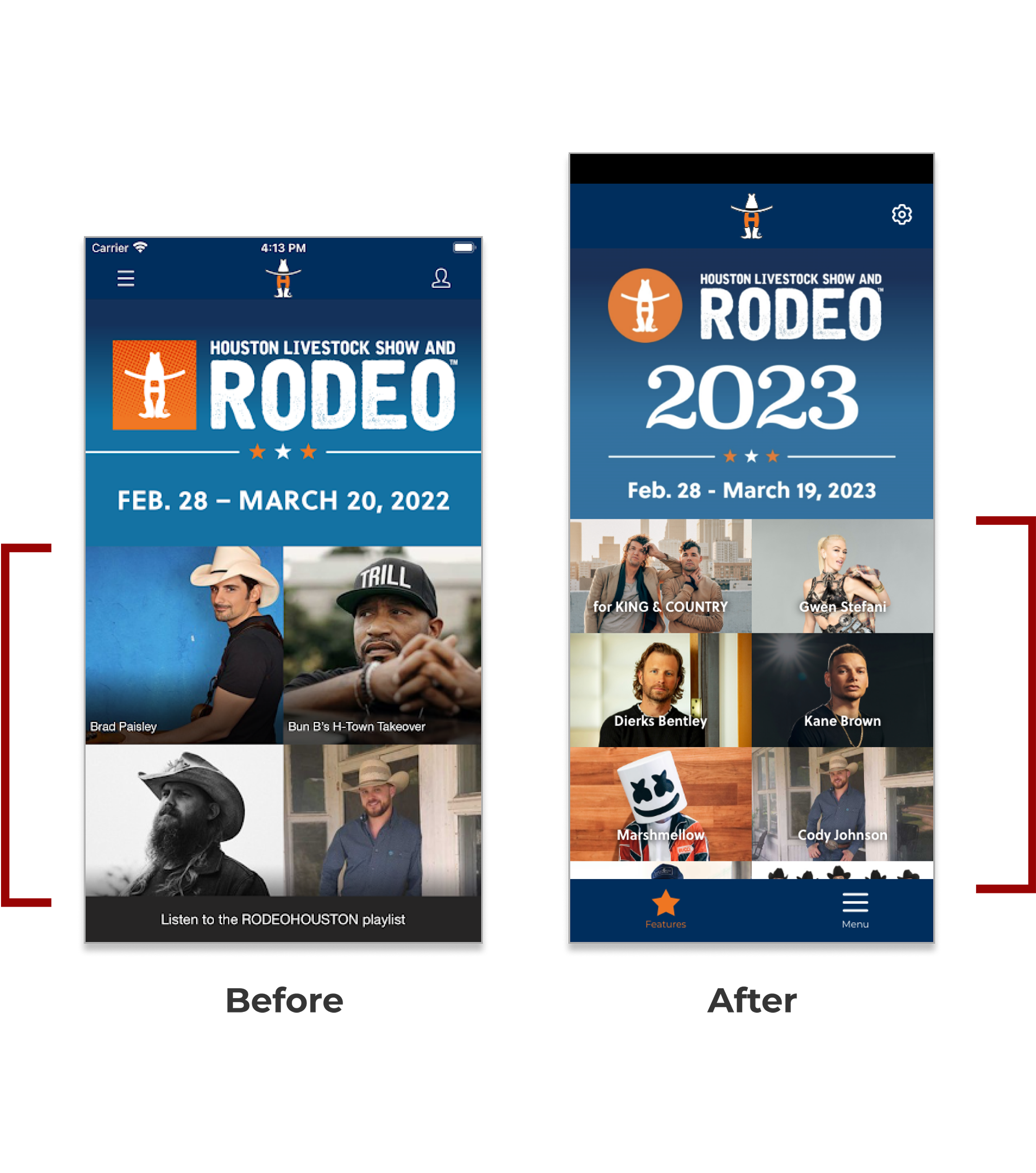
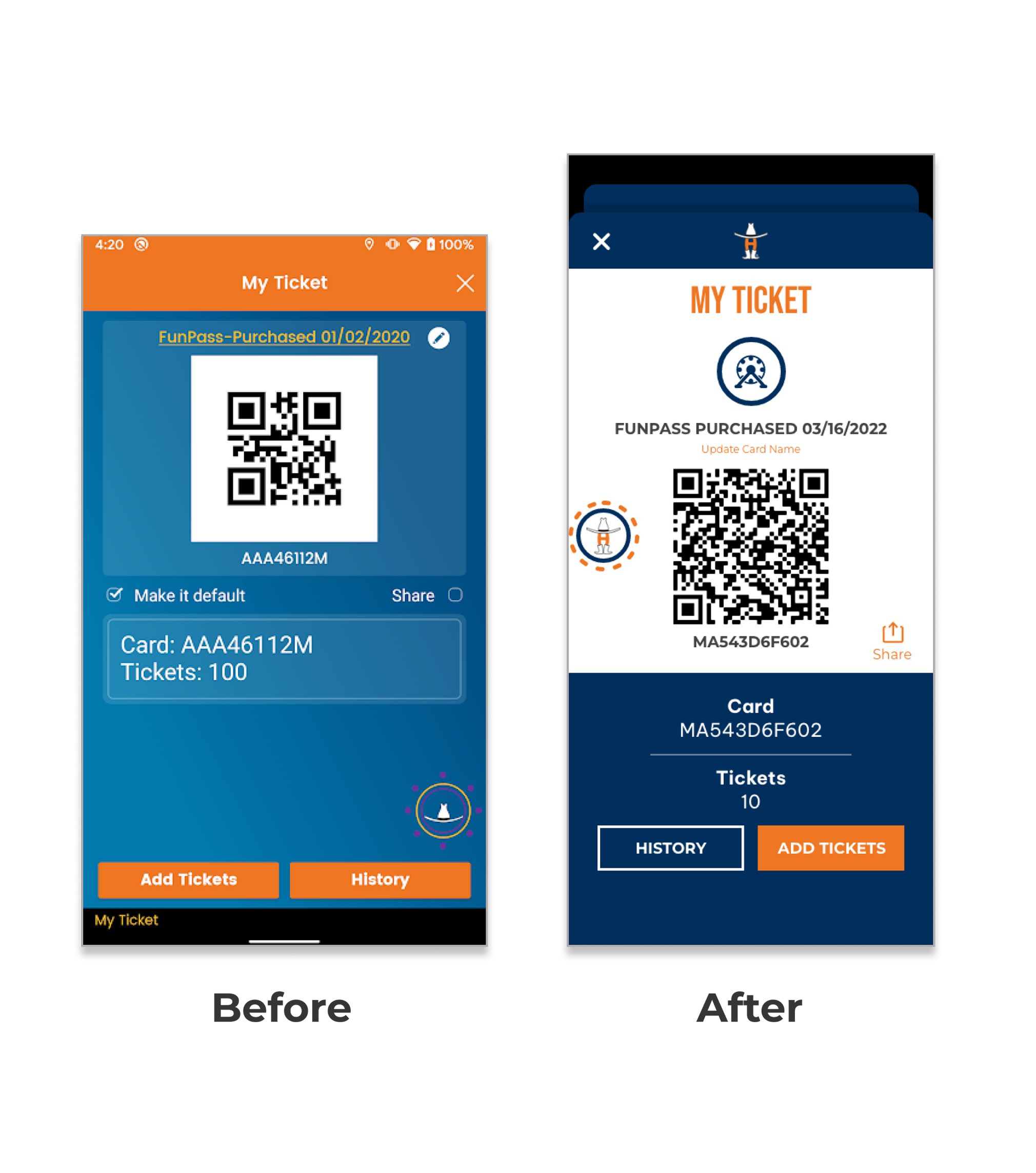
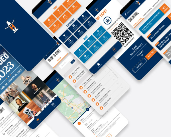
The Houston Livestock Show and Rodeo promotes agriculture by hosting an annual, family-friendly experience that educates and entertains the public, supports Texas youth, showcases Western heritage and provides year-round educational support within the community. During the event tens of thousands of users rely on the mobile app for entry tickets, parking, latest news, maps, food vendors, and more.
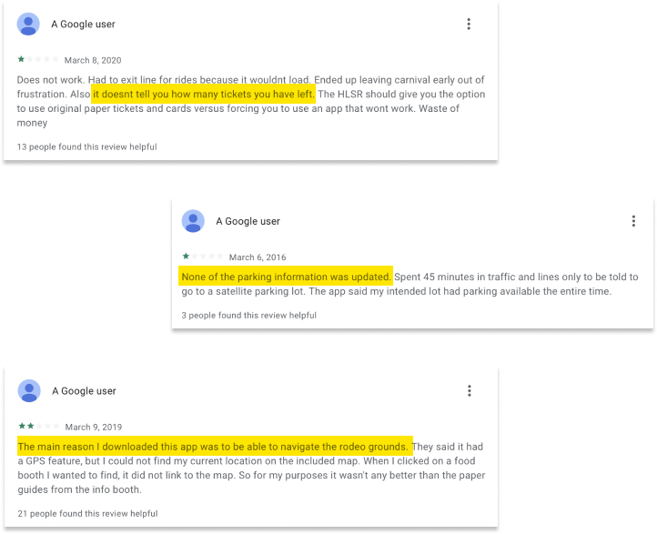
Problem
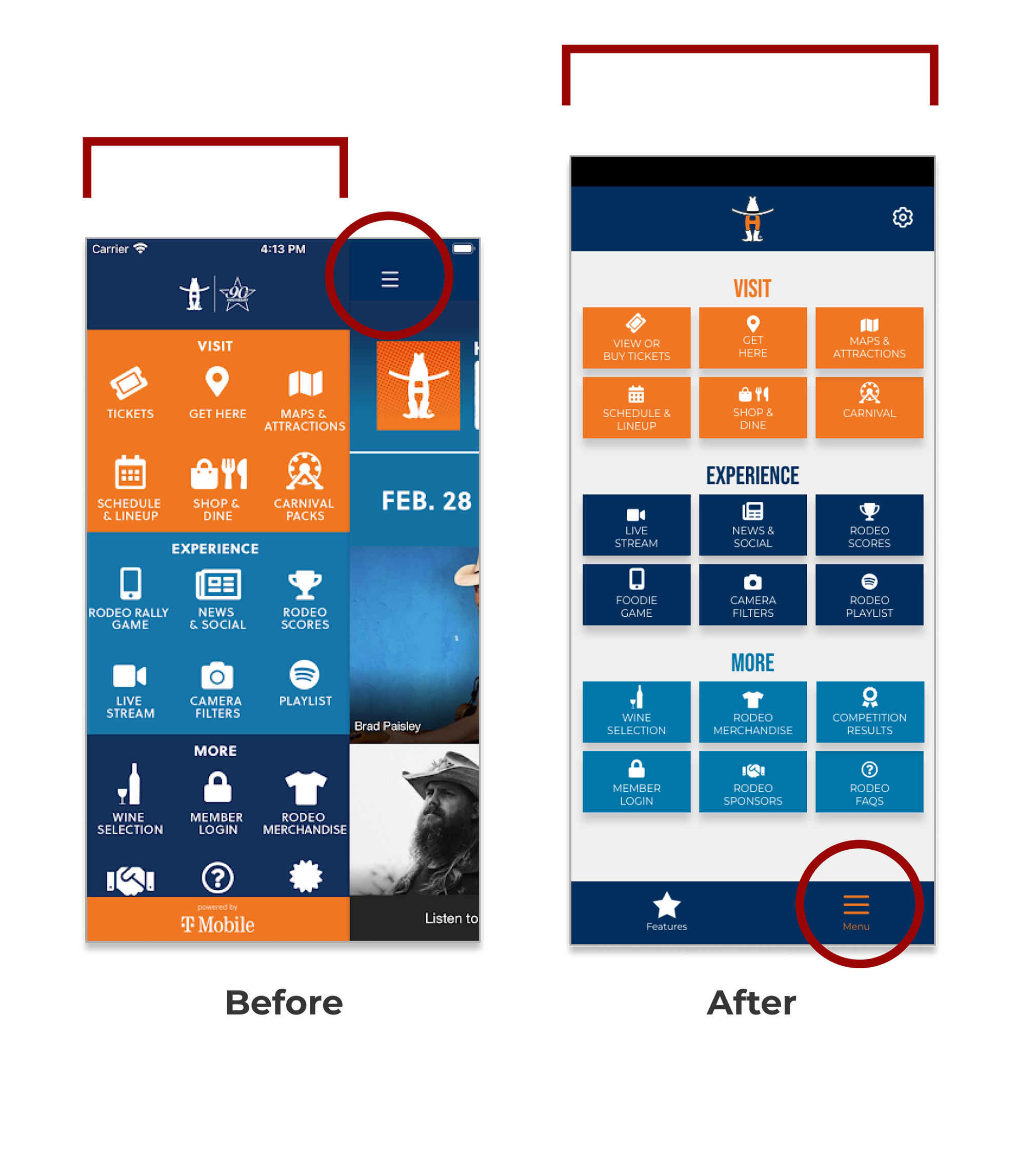
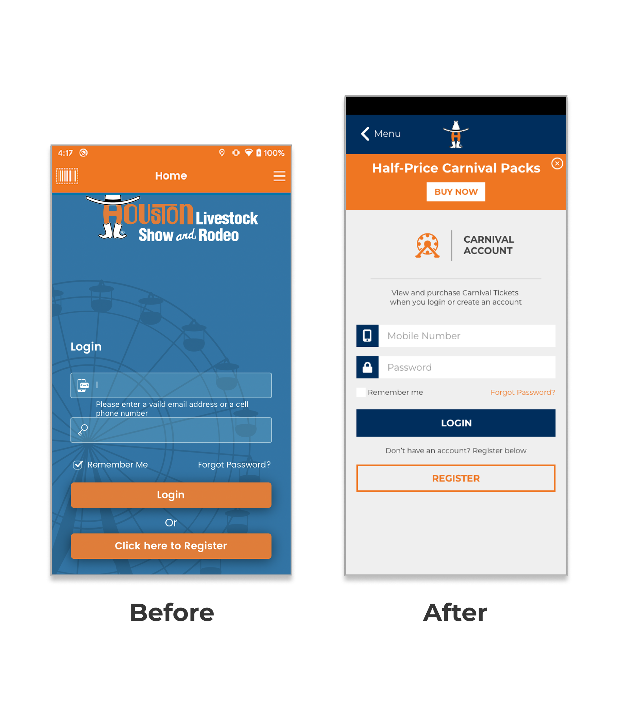
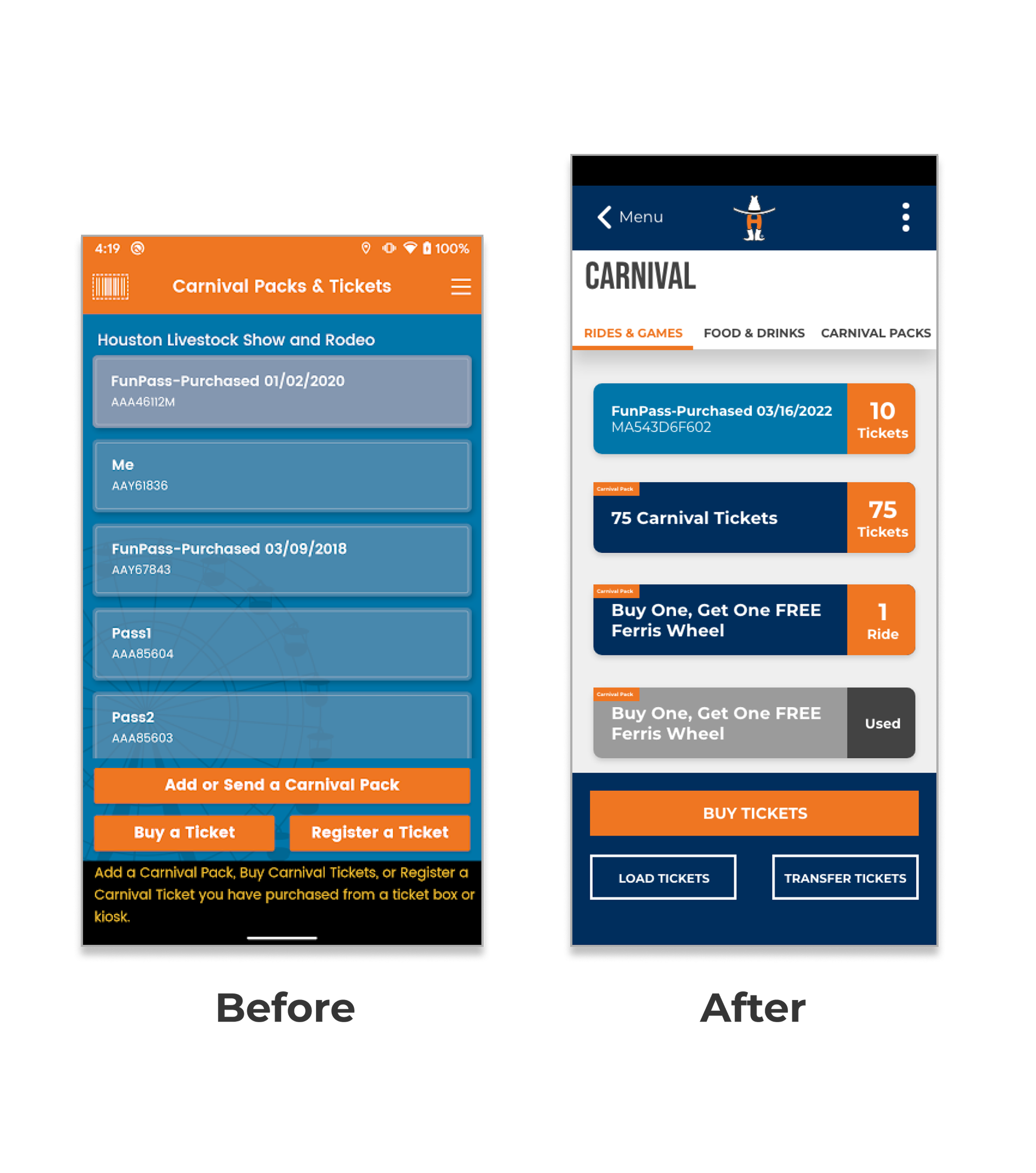
The app was built by a third party vendor that specializes in music festival app solutions. Additionally, there is a second app, built by a different vendor dedicated to the carnival portion of the event. By having separate apps, it was difficult to manage the user experience. Furthermore, since the app’s back-end code was not owned by the Rodeo, the app’s framework or template was limited to customize.
Solution
By creating a new app from scratch, the Rodeo will be able to create a better experience for their users. This will solve many of the concerns users have had with the app, gain user’s trust, and ultimately increase engagement.
Responsibilities
As lead of the project and designer, I gathered feedback and conducted research on users. Also, considered company goals during the discovery process. App functionality and architecture were key components, and the app needed to communicate with the Rodeo website. Centralizing the data and creating API calls to retrieve the data was a priority.
Results
The new mobile app merges two apps into one experience. Solving 30% of App Store feedback and meeting user needs. Full ownership and control over the app gives the Rodeo the freedom and flexibility to make necessary adjustments for user concerns.
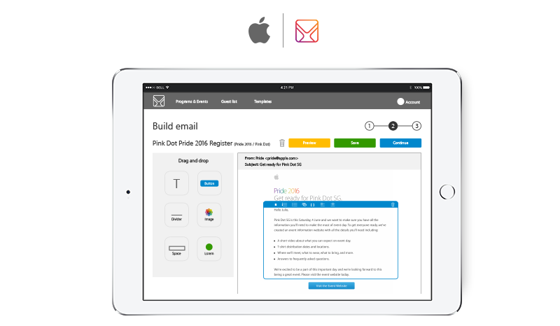
The Retail Internal Events (RIE) team in Cupertino, California focuses on hosting and supporting many Apple internal events. The team manages and markets the number of guest that are invited to each event. Designed HTML emails are sent to each guest as an invitation to RSVP, provide more info with links, ticket with QR Code, or a simple confirmation of the event.
Problem
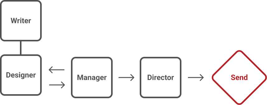
When it comes to HTML emails, there are many back and forth revisions between different team members. With only one designer managing and distributing the emails, It was hard to keep track of the email revisions. Sometimes the revision process was time consuming since the technical writer, account manager, and department director have to approve. In addition, the HTML file was passed around frequently and it was hard to keep track of the original file.
Solution
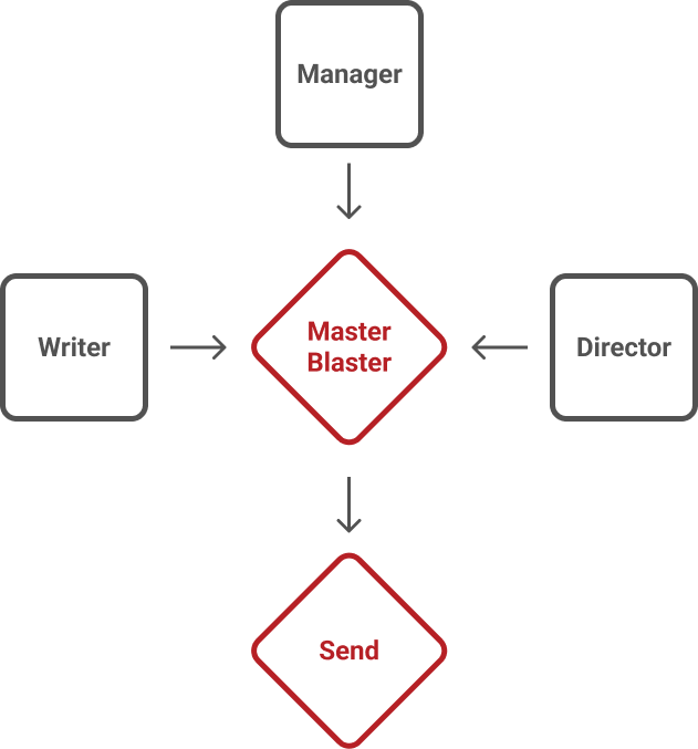
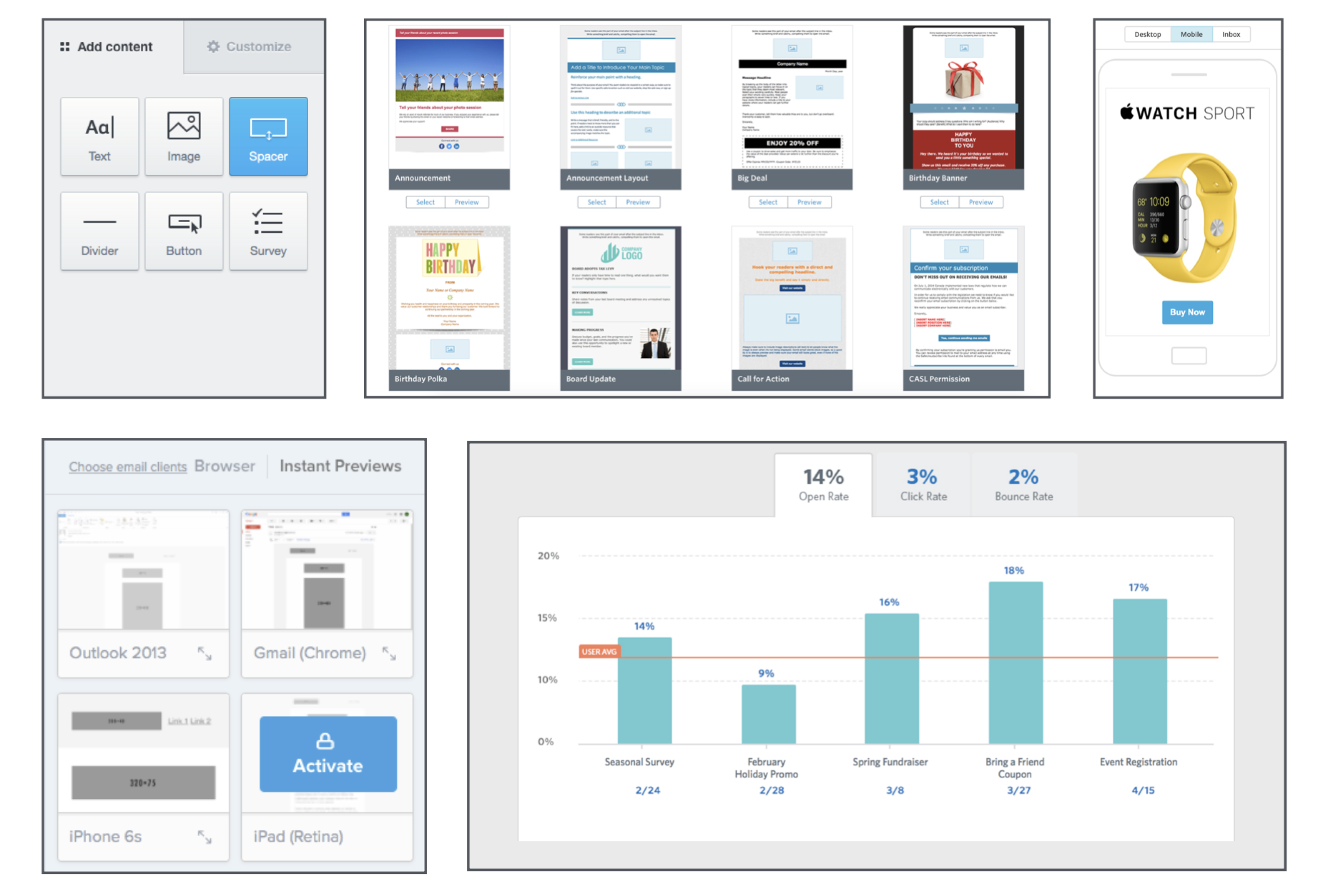
Third party email distribution web services could not be used due to exposing and compromising employee confidential information. The solution is to develop an in-house templatized communications builder, campaign manager, and email distribution conduit. This will allow everybody involved in the email revision process to view draft emails on the browser and make edits as they please. Account managers can also create their own emails by choosing from a library of templates and staying within the Apple standards. The designer is free from the revision process and can focus on the deployment of the email.
Responsibilities
As the UX/UI Designer, I was tasked to research different features and design the interface for project codename “Master Blaster”. I created discovery document that showcased all the features Master Blaster will consist of and how they benefit the team. After the research and discovery, I focused on the design strategy in making the user interface easy to navigate and the email builder easy to use.
Results
The interface followed Apple standards and consisted of 12 pages (Log in, Dashboard, Email Builder, etc.). A keynote presentation was given the team showcasing the user interface and all of the Master Blaster features
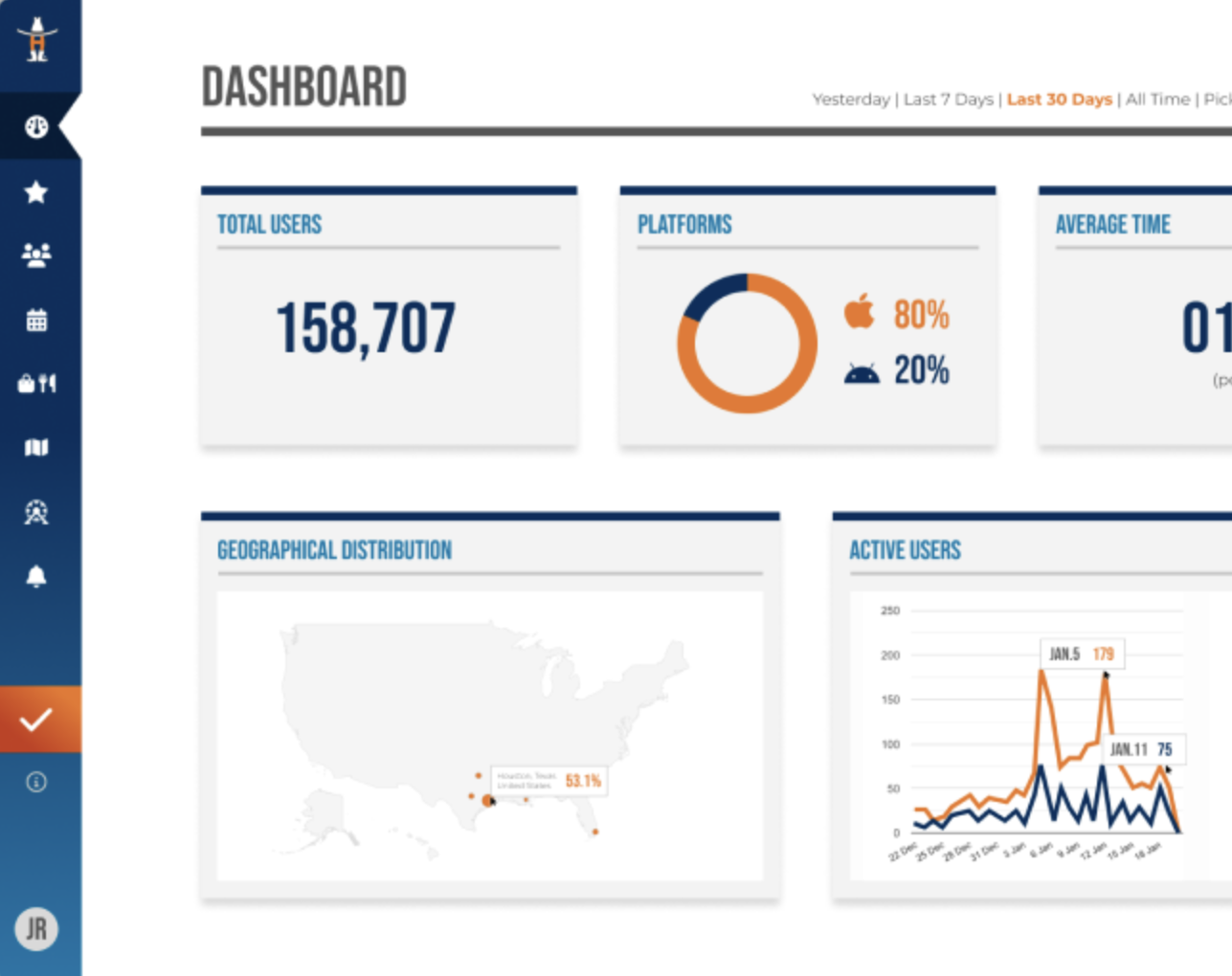
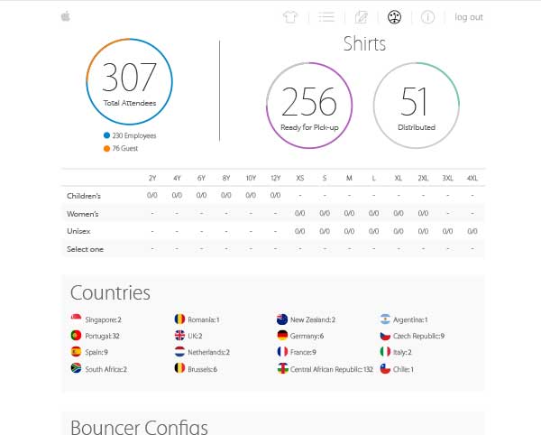
The Retail Internal Events (RIE) team in Cupertino, California focuses on hosting and supporting many Apple internal events. The team manages and markets the number of guest that are invited to each event. During the events, team members have admin access to realtime attendee information and analytics through a web tool called “Event Check-in”.
Problem
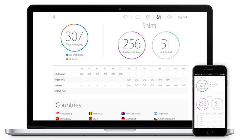
The web tool dashboard contained an overload of information. During these events everyone is working at a fast pace and require information quickly. Admin users struggled to find the information they needed.
Solution
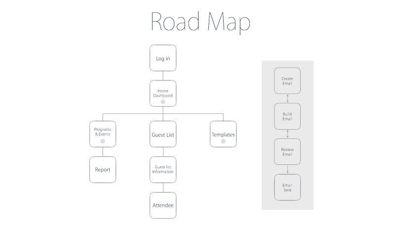
Admin users wanted a visually organized and appealing dashboard. It will give the user a clear visual representation of all the analytics during events.
Responsibilities
As the UX/UI Designer, I was tasked to dive-in and create a variation of visually appealing dashboard layouts. I focused on breaking down the information by chucks and color in order to simplify the analytical clutter.
Results
The interface followed Apple standards and alleviated the information overload issue. Admin users were able to easily navigate the dashboard and find the information they needed.